It’s the small usability things in Ramp that kill me where I have to constantly repeat the same thing over and over and all the unnecessary button clicks.
Case in point, My Expenses. We only use reimbursements here and not the Ramp card (sorry, but that isn’t going to change).
Every time I go into My Reimbursements I’m flooded with old transactions that are already Paid that I have to go through multiple clicks to filter out so that I can get to the new items. (Note that I keep this view sorted by Trip, so it is showing all my old trips).
Each and every time I go to this screen I have to:
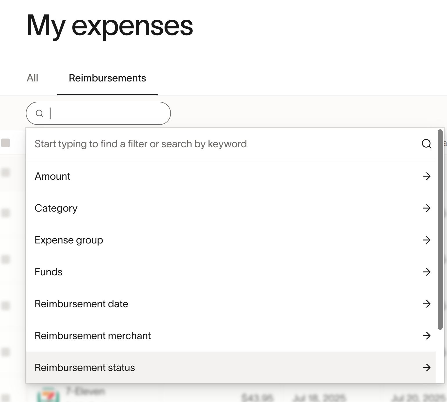
Then go here where I have to click 7 of the 8 buttons to see what I want to see.
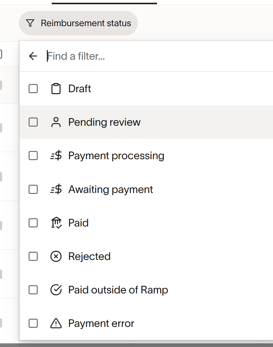
I want visibility of anything OTHER than PAID because it needs action.
At a minimum a Select All/De-Select All toggle would eliminate 7 mouse clicks.
What it REALLY should do is behave like Expensify where it retains my last filtering across sessions. So if I select a filter then it should just retain that filter until I decide to clear or change it.
PLEASE put some effort into these minor UX improvements that effect us all daily.