There are some ways to improve the UI for credit card approvals that could improve my process. I am making suggestions based on my role as the final approval (admin) along with processing an average of 600 approvals each month.
Remove the pop-ups - There is a small popup after I approve a transaction at the top which covers the “x” to close the transaction. It goes away in about 5-10 seconds, but the message does not help me. I know I’ve approved a transaction because the button disappears.
Next button - It would be helpful if there was a button to go to the next transaction after I approve one. I have to close the window and then reopen it to get to my next transaction.
Flag Transaction - Can you move this to the left or under “more.” Currently, it is in the middle of “Mark Ready” and “Approve,” and I’ve accidentally clicked on it.
Hi Cody! Yes, we have a formal way to upvote feature requests – it would be on the left side of the post. However, Roger’s original request was posted in February before we implemented this feature.
Appreciate your reply & and will pass your “upvote” along to the team.
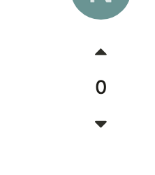
@Dave_Wieseneck – upvoting will look like the screenshot below! It will only appear on posts A.) originally made in the wishlist category and B.) created after May 1st.
Just wanted to bump this and see if there was any progress on implementation. All 3 suggestions would be very helpful for our organization – especially #2!
Hey Wayne! Appreciate you bringing this back up. No specific timeline to share at the moment - but I just submitted these as additional feature requests from you!
For #2 - figure you might’ve already tried this, but in case you haven’t - we do offer bulk approvals which might help speed up your review process (read more here).